

 Case studies
  About me
How efficient navigation solved our biggest reordering obstacle
-
 Apr ’26
 -
 Navigation
 -
 Product design
Company
Heineken, working on eazle, their B2B e-commerce platform for bar, restaurant, and shop owners.
Output
eazle's mobile ordering platform (Products, Orders, eazleClub, Account, Cart).
Role
Owned the problem end-to-end, spotting the pattern in data to design, testing, and iterating the solution.
Team
Worked alongside developers and the data/analytics side to trace the signal, run the test, and ship the iteration.
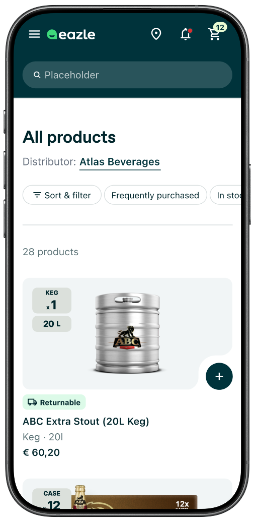
Control
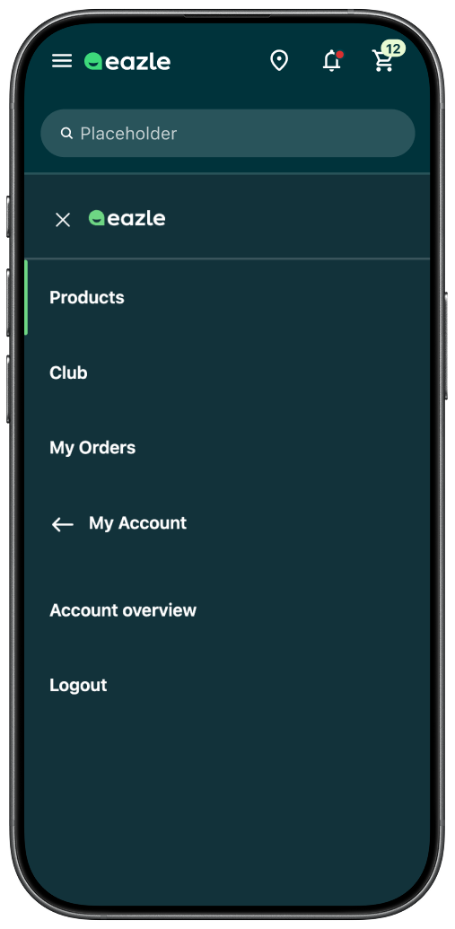
Expanded menu
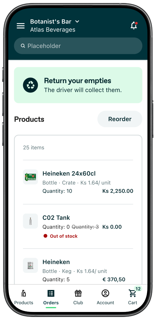
Variant (not final design)
A/B test we ran for 6 weeks. First attempt to solve the Navigation challenge.
Overview
On a B2B platform built for bar owners, restaurant managers, and shop owners placing recurring orders, every extra tap is friction. These are people ordering between shifts, often on mobile, with limited time and a clear goal: get in, reorder, get out. The faster they can move between the product catalogue, their order history, and their loyalty points, the better the experience. And for a long time, that journey was more cumbersome than it needed to be.
Spotting the problem
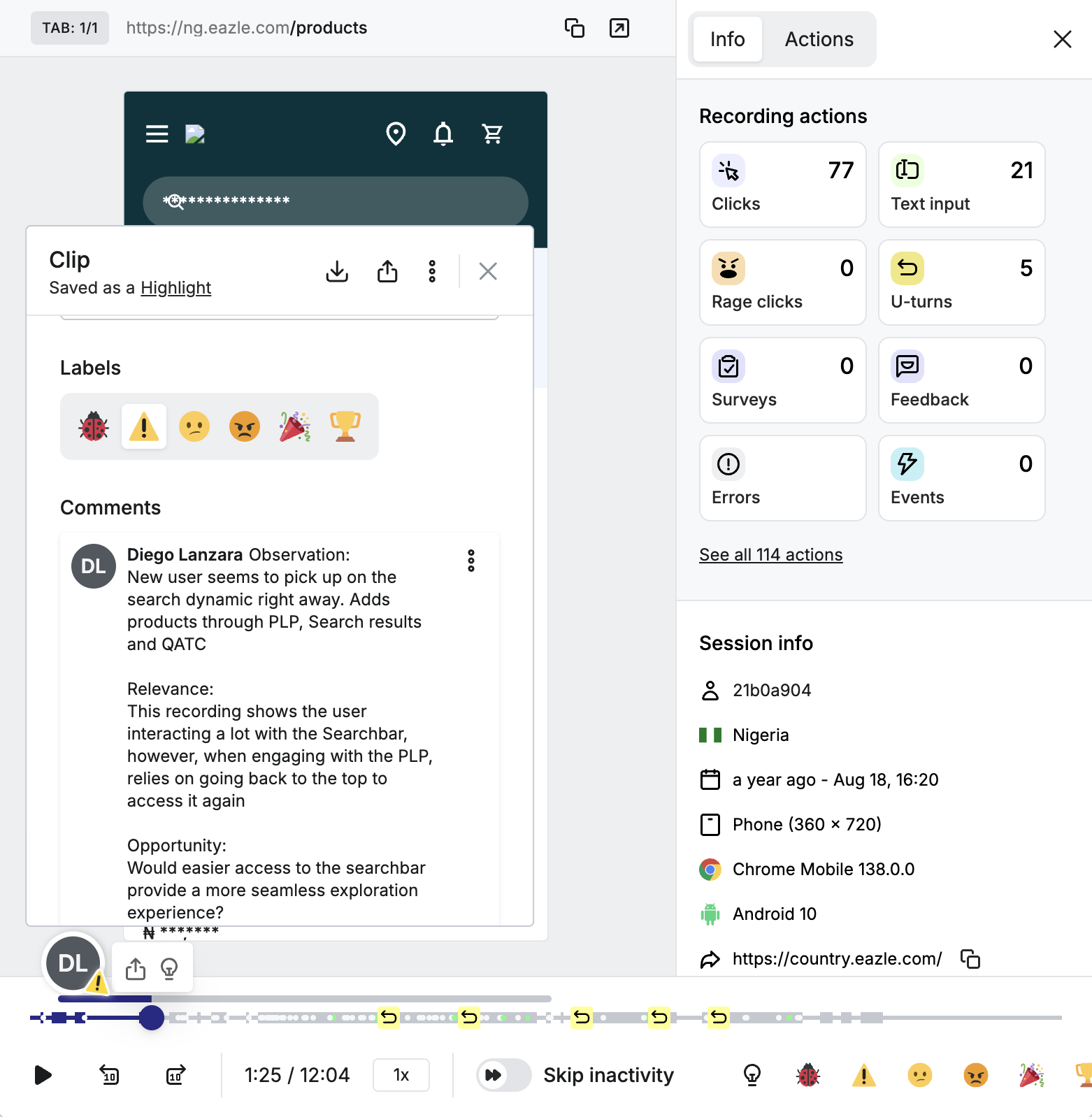
The signal came from the data, specifically from a User Behavior Watchparty session where the team was observing real user behaviour together. Heatmaps from our users in Myanmar consistently showed the hamburger menu as one of the most interacted-with elements across the PLP, Club page, and Order confirmation page. Meanwhile, our Q3 UX insights report showed that Orders and Club were among the most visited pages, with Order History ranking particularly high in South Asia and Singapore.
The pattern was clear: users were repeatedly navigating back and forth between the product list and their order history to cross-reference previous orders while building a new one. The only route available was through the hamburger menu, every single time. For a reordering journey built on speed and familiarity, that was a meaningful obstacle.
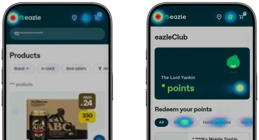
Hotjar heatmaps from Myanmar show the Hamburger menu as one of the most interacted with elements.
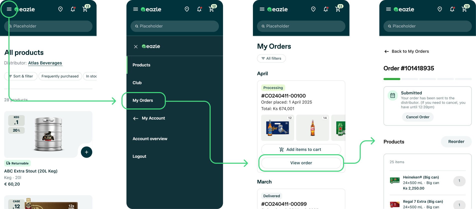
Users had to go through multiple steps just to reach their previous order details.
The hypothesis
If key sections were made more visible and directly accessible in the mobile navigation, users would move between the platform's core areas more efficiently. We expected to see an increase in visits to Orders and Club, and a reduction in the friction caused by repeatedly opening and closing the hamburger menu.
What we designed and tested
I designed a bottom navigation bar for mobile, giving direct access to Products, Orders, eazleClub, Account, and Cart. To run a clean test, we also removed the Cart icon from the header bar and kept the hamburger menu visible, specifically to see whether users would gravitate toward the more obvious navigation option even when the familiar one was still there.
The A/B test ran for six weeks across all mobile sessions in Myanmar, with a 50/50 traffic split.
What the results told us
The primary goal was achieved. Visits to the Orders page increased by 27.9% and Club visits grew by 3.4%. The bottom bar was used in 64.3% of all sessions, and hamburger menu usage dropped by 22.1%, which told us users preferred the more accessible navigation when it was available.
But the test also introduced friction we hadn't fully anticipated. Users expected the Cart icon to stay in the header bar, where they'd always found it. Moving it to the bottom bar led to a spike in Account page visits driven largely by mis-clicks from users aiming for the Cart. The reduced viewport also made product browsing slightly harder.
64.3%
of mobile sessions used the new bottom navbar
27.9%
Increase in number of visits to the Orders page
22.1%
Drop in hamburger menu reliance for navigation
3.4%
Increase in number of visits to the Club page
Iterating before shipping
The recommendation from the test was clear: don't implement as tested, iterate first. That's exactly what we did.
The core insight was that the bottom bar needed to be purely a navigation surface, not a home for transactional actions like the Cart. So in the iterated version, the Cart moved back to the header bar where users expected it, freeing up space in the bottom bar and reducing mis-clicks. The navigation bar was also set to disappear on scroll, giving users back the viewport space they needed while browsing the product list. The result was a cleaner separation between navigation and actions: top bar for session-critical tasks, bottom bar for moving between sections.
Control
Variant
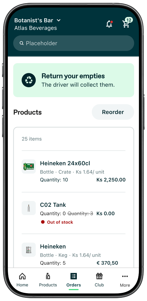
Final design
This progression shows the UI fix wasn't enough. Navigation items still needed work.
What I'm most proud of
We didn't just implement a popular UI pattern because it felt right. We traced a real user behaviour from behavioral data, turned it into a testable hypothesis, ran a proper experiment, read the results honestly including the parts that didn't go our way, and used that to shape a better solution. We shipped the navigation bar because six weeks of data proved it was the right solution, not because it looked good in a mockup.
What I learned
Familiar patterns can generate certain expectations, and moving the Cart caused confusion among our users, which we did not anticipate. That doesn't mean we should push back on change, but we need to be aware of what conventions we are disrupting and why. Testing the Cart in the bottom bar was a valuable decision in hindsight, because it gave us certainty about the consequences of disrupting too much too soon, and luckily we managed to adapt to that before we shipped.
Getting the first version wrong is what let us adapt and find the right one.
Other case studies


- Jun ’26
- AI
- Prod. design
When we used AI to turn compliance into a 2-min job
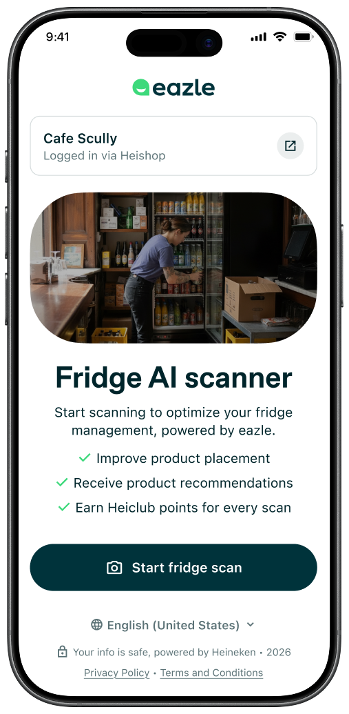
Outlet owners had no way to self-assess whether their fridges met Heineken's branding and placement standards without a sales rep visit. I led the end-to-end design of the AI Fridge Scanner, from conceptualization through on-site testing in Brazil to delivery across two markets, in 2.5 months.

- Nov ’25
- W.o.W
- UX research
When discovery became a team sport
A simple ritual changed how our designers, developers, and business representatives collaborated on building our B2B platform at Heineken. Insights coming out of discovery rarely reached the people building the product, and I wanted to fix that. I designed and led the concept of User Behavior Watchparties, where the whole team observed real user struggles together and built shared ownership over the solution.

- 2020
- Loy. program
- Prod. design
Designing for users who didn't yet trust digital banking
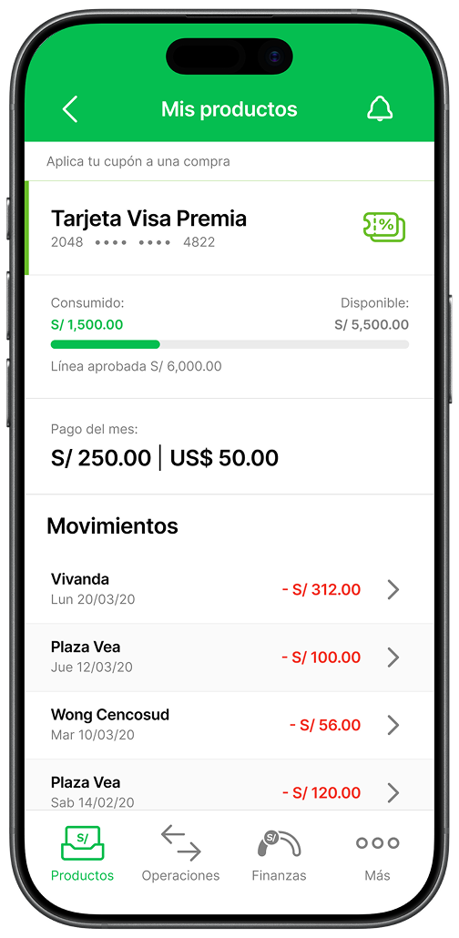
I led the end-to-end redesign of the Visa Premia credit card's loyalty program for Interbank, Peru's third largest bank, for users who were just warming up to online banking and were skeptical of big banks. Through multiple rounds of interviews and design iterations, we turned a program people had stopped using into one that doubled coupon redemption in six months.