

 Case studies
  About me

Designing for users who didn't yet trust digital banking
-
 2020
2020 -
 Loyalty program
 -
 Product design
Company
Interbank, Peru's third-largest bank, working on Interbank App.
Output
Visa Premia, the bank's credit card benefits and rewards program.
Role
Product Designer, driving research synthesis and dev. collaboration.
Team
Collaborated with a research team, other designers, and the tech dpt.
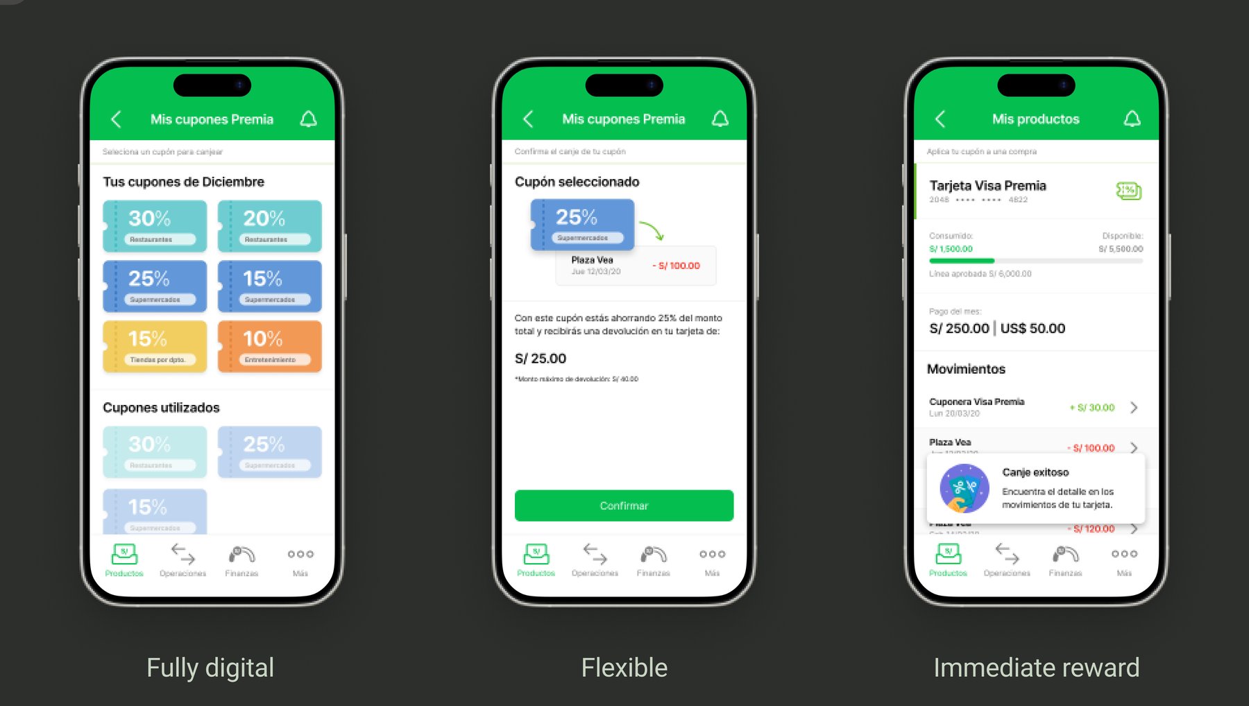
The three design principles that guided the redesign — fully digital, flexible, and immediate — shown across the reworked coupon flow.
Overview
In 2020, Interbank was Peru's third largest bank, with over two million customers and the number one credit card market share in the country. 36% of Visa Premia cardholders held what was, for most of them, their very first credit card. In Peru, credit cards carry real social weight, and their benefit programs are a genuine selling point. But Visa Premia's program was quietly fading, and customers weren't feeling the value. Our challenge was to understand why, and design something that could change that, for an audience that was just starting to trust online banking.
Who we were designing for
Our research involved three rounds of in-depth interviews with 24 users between 23 and 40 years old, a mix of online and offline clients, all credit card holders. What we found was a group of people who were warming up to digital banking but still carried a lot of doubt. There was a distrust of big institutions, a wariness about hidden fees and banking language that felt deliberately hard to understand. Breaking through that barrier wasn't a nice-to-have, it was the central challenge of the whole project.
The benefit program itself had its own set of problems. Users felt treated differently when they brought coupons to restaurants. Others would let coupons expire because they forgot to print them, or couldn't use them because of last-minute restrictions at the point of sale. The program required effort and planning to use, and even then it often let people down.
Designing a digital experience for users who didn't yet trust digital banking.
What we learned and where it led us
After synthesizing the research we built three design principles that would guide everything that followed. The experience needed to be fully digital, removing the reliance on printed coupons and offline redemption. It needed to be flexible, adapting to how people actually spent rather than forcing them into predetermined categories. And the rewards needed to feel immediate and tangible, because users consistently valued smaller, certain wins over accumulating points toward something distant.
From those principles came a clear direction: a cashback model where users could choose which expense categories to apply their coupons to, giving them genuine control over the benefit.
Testing our way to the right solution
We ran four rounds of concept and usability testing with 36 users, working from low to high fidelity across five design iterations. Early on, testing a range of concepts quickly showed us that customizable cashback was the most desirable direction. But testing also taught us something less obvious: the visual language of the product mattered just as much as the concept itself.
Our users were at varying levels of digital maturity, and the redemption process needed to feel familiar enough not to generate cognitive dissonance. If the learning curve was too steep, people would give up before getting any value from it. That insight pushed us toward a more figurative, illustrative visual approach over a purely abstract one, matching how our users thought rather than how designers prefer to think.
A setback that collaboration prevented from becoming a failure
Late in the project, a significant technical constraint surfaced: the tech department couldn't filter expenses by category, something that hadn't come up during their feasibility analysis. Without filtering, users would be left scrolling through unmatched expenses trying to guess which ones qualified for their coupon. It would have handed our technical problem directly to the user.
This could have derailed the project entirely. But throughout the process I had made a deliberate decision to bring developers into the design process early, inviting them to interview sessions, workshops, and synthesis moments. They had built context and empathy around what the product needed to do for users. When this constraint emerged, that shared understanding made it possible to advocate for the right solution rather than the expedient one, and to get the buy-in needed to solve the problem properly rather than shipping around it.
Results
Six months after launch, redeemed coupons per customer per month had doubled. Visa Premia holders who became primary app users increased by 10%. Monthly spending per customer grew by S/ 200 on average. Users who engaged with the cashback program also started exploring other features they'd previously only used in branches or at ATMs, paying bills, checking balances, gradually building a relationship with digital banking.
Some users even started planning ahead, waiting until the end of the month to strategically match coupons to their most relevant expenses. We hadn't designed for that behavior, but it showed up once people felt in control of their own coupons.
2x
Redeemed coupons per customer per month, six months after launch
+10%
Increase in Visa Premia holders who became primary app users
S/ 200
Average increase in monthly spending per customer
What I took from it
This project shaped how I think about the role of a designer. Making the design process more accessible to developers is the reason the project survived the technical setback and allowed us to deliver the best experience to our end users. Gaining that trust was as much a user-facing challenge as an internal one.
Other case studies


- Jun ’26
- AI
- Prod. design
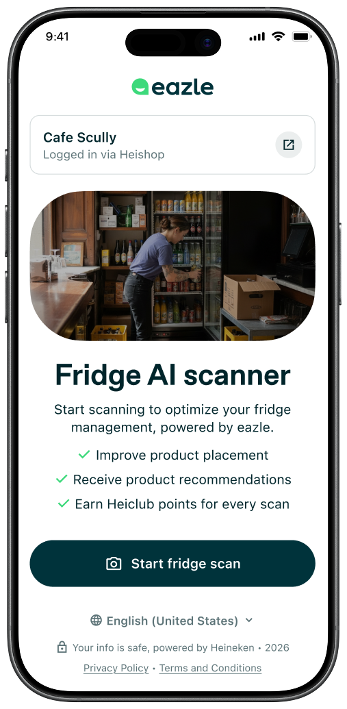
When we used AI to turn compliance into a 2-min job
Outlet owners had no way to self-assess whether their fridges met Heineken's branding and placement standards without a sales rep visit. I led the end-to-end design of the AI Fridge Scanner, from conceptualization through on-site testing in Brazil to delivery across two markets, in 2.5 months.

- Apr ’26
- Navigation
- Prod. design
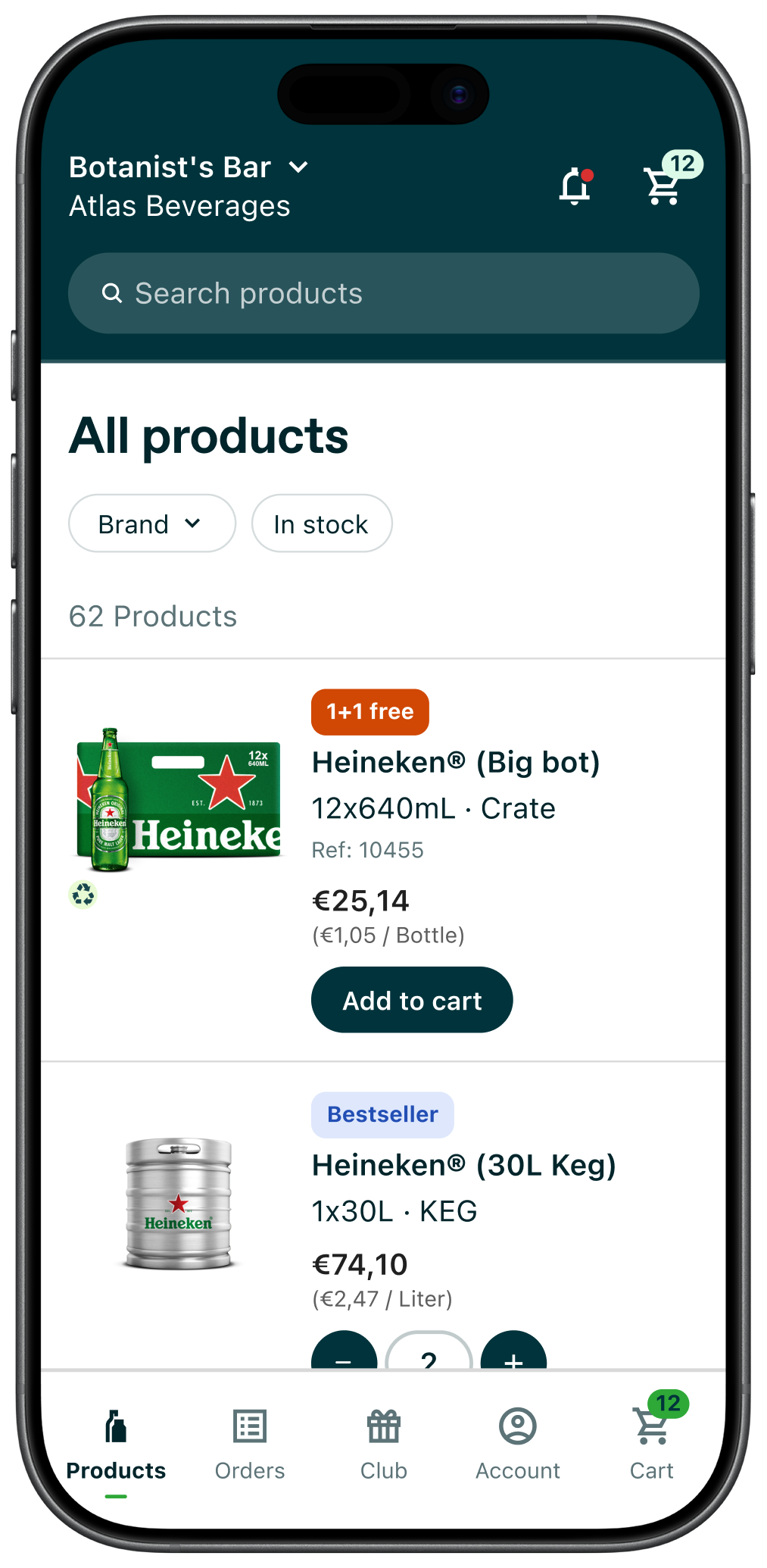
How efficient navigation solved our biggest reordering obstacle
Shop owners who need to reorder drinks frequently for their businesses were forced to repeatedly navigate between the product list and order history through a hidden hamburger menu. I designed and tested a bottom nav bar that brought key sections within reach, validated with real data, and iterated to make their reordering journey more efficient.
- Nov ’25
- W.o.W
- UX research
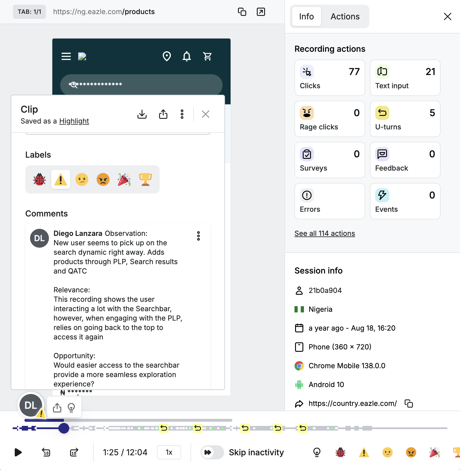
When discovery became a team sport
A simple ritual changed how our designers, developers, and business representatives collaborated on building our B2B platform at Heineken. Insights coming out of discovery rarely reached the people building the product, and I wanted to fix that. I designed and led the concept of User Behavior Watchparties, where the whole team observed real user struggles together and built shared ownership over the solution.